How selection bias will skew your activity mailing results

Here’s an interesting thing that I came across when evaluating a mailing for a client that I need to share.

Fallacy01

The observation

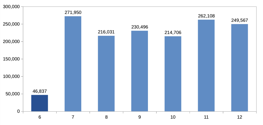
So what we’re looking at here is the revenue for a given group of customers from 06/2014 to 12/2014. (Note that the data presented here is completely fictional recreated in a spreadsheet, but follows patterns similar to the original data. See below for more details.)

This group of customers had been selected due to its inactivity as defined by the revenue in 06/2014 being smaller then a certain threshold (again, the actual selection was a lot more refined that is described in this model).

The mailing was sent out on 01/07/2014 to the group of customers. So we’re looking at a total revenue of $46,837 in 06/2014 and a subsequent jump in revenue to $271,950 in 07/2014.

At first sight, that seems to be great news – the mailing worked, revenue increased drastically, everything fine.

However, when I looked at preceding months, the following pattern emerged:

Fallacy02b

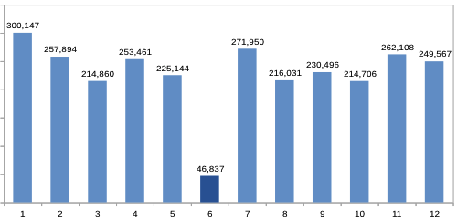
So our group of customers had a high revenue 01/2014 – 05/2014.  Then in 06/2014 – the month that was used to determine whether or not a customer was active – the revenue suddenly drops by about 80%, only to be back at the original level the following months.

Now this seems rather odd. In fact, it looks a lot like there’s something wrong with the analysis.

But as it turns out, it’s actually perfectly correct. What we’re observing is due to what I call the selection bias.

read more

How to tell if your results are significant – a practical guide

Marketers frequently face a situation like this: In a survey it is found that 57% of women prefer product A, while 60% of men prefer product B.

In this article I will show how marketers – using only simple statistical analysis tools available in Microsoft Excel – can quickly and easily decide whether or not they can draw meaningful conclusions from such a result, or whether they may be making fatal mistakes by interpreting random noise as valid data.

stats mofo

Marketers frequently face a situation like this: In a survey it is found that 57% of women prefer product A, while 60% of men prefer product B.

Some marketers will just go “Great, statistics prove that women prefer product A, and men prefer product B. We’ll market product A to women then and product B to men.”.

But is this really always a valid conclusion? Couldn’t it also be that the difference is purely coincidental? After all, we haven’t asked all people, but only a subset of people: those participating in our survey. So maybe if we took another sample, and asked different people, the results would be different? May well be!

Statistics to the rescue!

As is often the case, statistics can provide a solution. Before delving into the details, let’s look at another, more formalized example. Dice!

Suppose we take two dice, and we want to know if one of them is loaded, i.e., we want to know if one of the dice yields better values than the other. Let’s start by throwing them 10 times each. This is what the results may look like:

Example 10 dice

Well. What do we get? Let’s look at the mean value for each die. As a reminder, if the two dice were fair dice, there would be an equal likelihood of one in six for each number to turn up. More formally, the expected value would be 3.5 (=1/6*1+1/6*2+…+1/6*6).

So what do we get for our dice? For die 1, the mean is (4+4+4+…+3)/10 = 4.40, the mean for die 2 is (5+2+1+…+1)/10 = 3.20.

So is die 1 better than die 2? Well the average is higher, of course, but as you will intuitively suspect, 10 throws is quite a small number of throws to draw any meaningful conclusions.

read more